About Me
- Diane Widler Wenzel
- Documenting a period in my development that could become pivotal
Monday, September 16, 2013
Painting water reflections seen through blades of grass.
Mist is rising from the slightly breeze kissed water. The mist softens the forms of the grass. 55" long and 38" wide keeping the acrylic damp was possible because of the coastal mist and high humidity. The humidity dictates the way I paint outdoors especially on large canvases.
In the tidal waters there should be no surprise in catching a crab with a worm.
On this 18" square canvas I spent most of my time painting the grass because the blades tended to disappear in the lively sparkling waters. I also used acrylic on this painting begun on a less humid sunny day.
Saturday, September 07, 2013
Challenging Myself to More Difficult Painting - a journal
Goal: Gain the satisfaction of having extended myself outside
of my comfort zone.
What I did:
Made video
recordings of my step by step resolution of a large outdoor oil painting.
I have been inspired by Terrill Welch’s videos on
painting on larger canvases and feel gratified by the camaraderie of Facebook
artist acquaintances. Videos are an entirely new medium to me.
Worked larger than I thought I could any more.
Since I have been working almost entirely in acrylic for large paintings for 48 years, I am amazed how I remember how I used to paint when I try some new ways to manage my solvents for oils.
Worked larger than I thought I could any more.
Since I have been working almost entirely in acrylic for large paintings for 48 years, I am amazed how I remember how I used to paint when I try some new ways to manage my solvents for oils.
Learned that Trader
Joe’s vegetable soap and water are useful to break down the pigment washing brushes after
each painting session. This soap saved me from the fumes of paint thinner. A
big deal for me because these fumes can give me a head ache.
Applied the paint in ways I do not remember using before. In the past I have added linseed oil if the paint was thick and drying out. But for painting mediums I used to use turpentine and paint thinner. This time I used enough linseed oil to making a spreading medium. The paint was thinned enough to drip on the canvas.
The linseed oil made the paint shinny before drying. The paint dries in a couple of days to a matt finish. More permanent is the liquid looking shape of the brush strokes.
Became more aware of the stages of development of the painting.
The first burst of energy can be frantic when performing in front of the camera because I am trying to paint over a large area in a short time. The second stage is where specific areas do not measure up to favorite areas. Quick fixes invite picking at the painting. To avoid picking, I kept saying I wanted to keep the whole painting in mind and work all over but I could not avoid this stage. The next step is obvious - a rest where the painting is put away or just left in view where the mind can subconsciously work on it. The next stage is returning to the canvas after working on others so the canvas is no longer precious and I can try painting all over the canvas to resolve perhaps a new goal. The last step should be the signing of the painting in which a few details are carefully selected for revision. Revisions are to be consistent and important to the meaning of the painting. Sometimes after the signing, I continue to want to make changes.
Applied the paint in ways I do not remember using before. In the past I have added linseed oil if the paint was thick and drying out. But for painting mediums I used to use turpentine and paint thinner. This time I used enough linseed oil to making a spreading medium. The paint was thinned enough to drip on the canvas.
The linseed oil made the paint shinny before drying. The paint dries in a couple of days to a matt finish. More permanent is the liquid looking shape of the brush strokes.
Became more aware of the stages of development of the painting.
The first burst of energy can be frantic when performing in front of the camera because I am trying to paint over a large area in a short time. The second stage is where specific areas do not measure up to favorite areas. Quick fixes invite picking at the painting. To avoid picking, I kept saying I wanted to keep the whole painting in mind and work all over but I could not avoid this stage. The next step is obvious - a rest where the painting is put away or just left in view where the mind can subconsciously work on it. The next stage is returning to the canvas after working on others so the canvas is no longer precious and I can try painting all over the canvas to resolve perhaps a new goal. The last step should be the signing of the painting in which a few details are carefully selected for revision. Revisions are to be consistent and important to the meaning of the painting. Sometimes after the signing, I continue to want to make changes.
In my “Lunch at Mildred’s”, another painting done at the
same time as the video recordings of “Rhitner Creek”, I used a lot of paint out
of the tube without a medium to increase the soft pastel effect. I scrubbed
with the brush and mushed the colors together.
To some degree the dry brush made a pleasant effect. The dry
application is usually unpleasant. Dry brush on a rough surface leaves specks of color underneath.
I was surprised to find a sketchy area which was very direct with energetic movement. Overall the painting makes me want to put on my glasses when I am, already, wearing them. Expressions of the people are secondary to the softness and I want their feelings to carry the painting more. I am thinking of painting another one of the lunch with decisive outlines and strokes of color showing contrast.
“Near Painted Hills” was a 15 minute tail gate painting
started in June. Then I worked on the foreground in three sessions. One right after returning home, I put the
painting up where I past it every day, then Sept. 3 at Coyote Rock Marina. Big drops of rain fell so I quickly used some
left over paint mixed in the lids of heavy body acrylics. The energy of the
storm and the pressure of finishing before the downpour psyched me up to the
same impulsiveness as when I started the painting on location.
Saturday, August 24, 2013
"Lunch at weaving village, Santa Catarina Barahona, Guatemala" , 22" x 28" oil
Mildred weaves. Full spectrum colors through her fingers become finely woven double sided designs for table runners. She is a business woman selling her weaving to add to her husband's wages in the field. She has done well. At 27 she has four children and owns a fine china cabinet. Color yarns fly through her fingers while she is sheltered by a manicured, gray, unbaked clay floor, corrugated steel roof between cement block walls of neighboring buildings. Her home is open air to let out the kitchen fire smoke. Unfiltered open air light is fine to judge the color effects.
I am honored to own a work that took her two and a half weeks to make. But I feel a little guilty because our tour company, OAT, wants to keep the lunch in the home of a Mayan specifically as a cultural experience and not a sales op. I on the other hand feel enriched by knowing the artist and by having a glimpse of her life.
I hope my painting is a worthy documentation of Mildred's life as a weaver and woman in a cluster of extended family households. Having extended family working together makes her weaving for hours and hours possible.
So a simple humble dwelling might be ideal in a land of many earthquakes and volcanic activity?
I am honored to own a work that took her two and a half weeks to make. But I feel a little guilty because our tour company, OAT, wants to keep the lunch in the home of a Mayan specifically as a cultural experience and not a sales op. I on the other hand feel enriched by knowing the artist and by having a glimpse of her life.
I hope my painting is a worthy documentation of Mildred's life as a weaver and woman in a cluster of extended family households. Having extended family working together makes her weaving for hours and hours possible.
So a simple humble dwelling might be ideal in a land of many earthquakes and volcanic activity?
Tuesday, July 09, 2013
Frederick Heidel's 1991 watercolor, "Two Up and One Down" is a poetic window into his coping with wife F. Saltzman's death?
***
The accuracy of my interpretation of his biographical life is not the point. I will see a different scenario tomorrow. Also my recognition of people and animals are not conclusive. Other people can have widely different experiences with it. The point of trying to interpret his painting is to strengthen my own painting vocabulary to express my emotions. His painting could reveal the steps in its resolution and what painting could do for quality of life.
* * *
I studied painting under Heidel my entire undergraduate years in the early 60's at Portland State College, Portland, Oregon. In 1976 I took a watercolor figure painting class and learned more that was relevant to his watercolors like this one.
In 1997 I wanted a Heidel painting to inspire me in color and imagination. But didn't know which one to pick. All of his watercolors had beautiful colors, maybe even more so then this one. I was drawn to "Two Up and One Down" partly because the figure bowing her head towards the bunny looked to me like Heidel's deceased wife, Florence Saltzman.
*
Florence is a flower looking downward reminding me of her body gestures. The red scarves she wore over her hair! Her high forehead too!
Accidentally or giving the appearance of naturally occurring, Florence's little nose and little point of a chin came into being late in the development of the painting as her profile is the edge of the darker layer of green in the background. More difficult to recognize is the negative area above Florences' high forehead. For me the purple and green dark background becomes positive hair pulled back into the red bun.
I realize Heidel may not have seen his deceased wife in the flower he was painting. If he did, he may not have seen it until nearly finished, when painting the background and then did not choose to pop it out any more than it is.
I did not have Florence as a teacher, but I have special memories of her. Accidentally we were at Myer and Frank's housewares at the same time. She was buying wedding gifts for graduating students who were getting married, one of them being me. With a knowing gleam of satisfaction in her eyes, she asked for my approval of salad serving spoons in my stainless pattern.
Clever choice on her part! Every time I use the serving spoons, almost every day for 48 years, I think of Florence. Often I ask if my painting experience measures up to her wisdom. I usually ask if painting was a part of my every day doings as she had made painting in her life. I ask myself if painting is a language to me too. Every salad I make, I remember Heidel and his vegetable garden paintings and the art of living as they enjoyed.
*
Another reason for selecting this painting was my fascination with paintings of three figures in general like ones of Supper at Emmaus'. Or Diego Rivera's painting of Freda just after she died and his other woman! These paintings have visual language symbolism in the placement and the presentation of the figures.
*
I felt "Two Up and One Down" would be a painting that I could look at a long time and would keep seeing something new. I wanted to recall Heidel's parting comments when I finished my undergraduate studies. He said he did not prepare students to be successful at selling. He hoped my art journey would be a rich development. He hoped he had not squelched my intuitiveness. He wanted me to always paint what really mattered to me. He believed in keeping work for a long time to assist in one's development. He wanted my intuitive poetic self to develop and blossom.
In keeping with his desire for his students to find their own way, he never demonstrated in class his own painting. In my four years as a student, I never went to any of his art openings or even looked at his work. To my knowledge Heidel did not have numerous new painters following his direction in painting. At his memorial exhibit, I expected to meet other former students, but I was alone as far as I know.
Some of his students over a 30 year period must have been successful selling. But maybe not many. Heidel shared with me that right after graduating from the Chicago Art Institute he thought people would not want to buy his paintings. Not caring if he sold, he thought selling art can stunt creativity. Or maybe when a painter is just starting out finding their voice, the market can divert their efforts from reaching a rewarding painting experience.
In years since his advice, I see examples of artists who thrive in their creativity when they are selling. But for me, I work in many directions when the market demands more of the same and discourages my exploration between the acceptable genera. Furthermore, he did paint more and more for the market as he grew older. He kept his earlier work which now surface in galleries after he passed away.
Fresh out of college, despite his advice, I put my work up for sell with some success. The work was object orientated, just the opposite of what I said my interest was when I was a student. As a student I said the subject was only a springboard to being poetic.
His interest in subject as a springboard is evident in his work. For example, Heidel painted from his garden as a beginning for an internal symbolic journey in "Two Up and One Down". The flowers were not important as flowers. They were symbolic of people and the fragility of life.
When he painted watercolors like this one, he was also making fused glass windows. The glass interest carried over to painting. Or was it the paintings carried him over to making fused glass? In "Two Up and One Down" the entire picture plane is covered by pencil lines forming a shattered glass grid. The shattered glass was symbolic of what his life was shattered by the death of his wife, Florence.
When I painted thick on coarse textured linen, Heidel asked me why I liked the texture. He said he liked smooth surfaces. True to his earlier likes he selected smooth hot pressed Arches watercolor paper for "Two Up and One Down". The smooth paper picked up every nuance of his impulsive nervous tapping of a sharp pencil to deliberate, weighted slow marks. If these pencil marks were applied in the same way on rough, wet paper, they would be blurred or broken up.
Heidel's whole process is revealed from his early light pencil drawing to later heavier emphatic statements. Struggle was revealed by eraser marks or by lightening areas with white pastel. He erased heavy lines on the tall thin lily I associate as being him. His lily stem became thinner by making what was his body part of the background.
His painting, I believe, was a part of his life's indecision and struggles on how to plant his legs and the bunny's feet. He made Florence's skirt smaller erasing a thick line that made a larger area in the background. He left two legs one bigger than the other. Both look like they are solid and ready to stay while the two parts of Florence's upper parts form a red nosed, yawning specter with arms stretched out to leave.
*
An interesting mystery within grasp of a conclusive solution, is deducing what color went on first and then following each layer upon layer.
He started with Florence's face. He painted the figures first and then the back ground redefining the figures dimensions when painting the negative area around them. His last color was a violet over the bunny's nose, shaking or blotting the color on the margins he used the same brush load for another final layer over layers of darker greens in the background.
Heidel in the figure painting class had us experiment trying different approaches to where we began on our figure paintings. Either the positive areas or the negative. Either with warm colors or cool. There isn't a right or wrong way.
*
He started with Florence's face. He painted the figures first and then the back ground redefining the figures dimensions when painting the negative area around them. His last color was a violet over the bunny's nose, shaking or blotting the color on the margins he used the same brush load for another final layer over layers of darker greens in the background.
Heidel in the figure painting class had us experiment trying different approaches to where we began on our figure paintings. Either the positive areas or the negative. Either with warm colors or cool. There isn't a right or wrong way.
*
Another interesting mystery is to follow his emotions as he painted and drew. Lines applied quickly and lightly express a different emotion than lines made bearing down strongly and heavily. There are lines drawn between Heidel, the blushing lily, and Florence's heads or head. The section on top of Florence could be one of the breasts that was removed in a mastectomy.
The lines are light pencil. The lower one from Heidel's stem travels beneath the bunny's green scarf, traversing Florences' closed eyes to her ear and bun. There are number of "x'' marks along the lower line and an x on Heidel's stem throat. My guess is the "x" cover something that is no longer. They could no longer speak to one another.
A much darker and deliberately executed line made late in development of the painting is a dark line on the right edge of the blushing lily. The line goes up from the heart along the throat clearly defines his direction towards the bunny with a definite arrow on the lily pointing to the right bunny ear. Heidel said that a line can be made with sensitivity through out its course with the way they begin and end being very important.
The blushing lily and the bunny look as though they will head for the horizon and Florence will exit to the far right leaving the shattered glass life behind. In life Heidel remarried.
Whether Heidel used a painting method to make life decisions is unknowable. "Two Up and One Down" is not even likely a life pivotal painting. The date of this painting is 1991 while the date of his life shattering experience is closer to 1966 or 7.
*
In "Two Up and One Down" Heidel followed the directives of Florence Saltzman to demonstrate that visual painting is a language. Heidel's "Two Up and One Down" can be read like poetic writing. Heidel's painting brings new possibilities to me on Florence's will to have painting a part of her everyday doings. Everyday doings can include life adjustments through painting?
*
When I set out to buy a Heidel, I wanted to paint bright colorful happy acrylics like his. Then I bought a painting that communicates as much through drawing as through color. Though his painting suggests to me a sad part of the Heidel's lives, painting sweetened their lives - "Two Up and One Down" is a happy to me.
As for the meaning of the painting for my art: I am going to evaluate what my needs are. How much I need it to be happy? If I am still drawn to textured surfaces, I will examine how I am getting across what I want to express on textured surfaces. The order in which an intuitive painting is made? Are the shapes defined in the positive or defined with the outline of the background? Allowing the viewer to guess at the order, to muse over the meanings is an enticing way to speak through making marks. Like Heidel did, I will look at art history examples of textured surface to find the range of expressive texture vocabulary that I can bring to my work. I see he employed drawing techniques of twentieth century painters in a book he shared in figure painting class. So will I.
Sunday, June 23, 2013
Interpreting "Ritner Creek" over time
The last time I painted large scale streams on 3 foot by 5 foot or larger canvases was about ten years ago. I was discouraged by my market that dried up. Several attempts at winning commissions for public places failed, and the economy slumped.
At age 70 I must wait no longer to bite into another attempt. I want to share what I have learned. I find painting large meaningful. The extra effort is thrilling and challenging. Working large so my whole body flows like water. I paint the energy I feel as much as what I see.
I used to say that I danced when I painted. Rhythm was what I felt in nature. When I watched myself with brush in hand, I was amazed to see myself moving like I learned from a few ballet lessons when I was10 years old.
In other ways the videos are very humbling. I am having difficulty both talking and painting at the same time. I have terrible stage fright. These recordings are safe on a flash drive and waiting for me to learn how to edit a movie.
Tomorrow I will record the final steps in resolving this painting.
Tuesday, June 04, 2013
Outdoor painting is not necassarily better than working from photographs
Tuesday, April 30, 2013
| My tool for color designing. |
Thirty three pieces are ready to hang up May Day tomorrow. The exhibit is dedicated to all those people who think they can't be an artist.
“Making Memories”
collage and water media paintings expose my creative play and struggles. I believe even if you do not make the
greatest and the most saleable art, immersion in visual language is a rich
learning experience and can be a vital part of every aspect of living.
Follow my art journey.
Painting /collages going back as
far as 1966 are hung according to how they relate to my development not in
linear time. But a sense of passing time can be seen because they are numbered
in order and dated. Each label has a few
words on my reasons for making art her life.
Where: The Albany
Main Library second floor
2450 14th Avenue SE
Albany, OR 97322
When: May 1 through
June
Monday –Wednesday
10:00 a.m. – to 8:00 p.m.
Thursday –Friday
10:00 a.m. – 6:00 p.m.
Saturday 10:00 a.m. -5:00 p.m.
Sunday: 1:00 p.m. – 5:00 p.m.
Tuesday, April 16, 2013
Preparing May and June art exhibit at the Albany Public Library
Being sentimental, I have titled my next exhibit - "Making Happy Memories". Not all of my paintings are happy to me. Some are about environmental issues or other politics. Some are about angry emotions. These disturbing images are not to be in the library exhibit.
I am taking the labeling of the paintings seriously. On each name tag I make a short artist statement. Pictures of book covers are included. Some of these memories are realized in the subconscious with belated recognition.. Also I made, while working, conscious inclusions of books which were favorites from years ago.
My careful labeling with dates is motivated by my desire to share the development of ideas and process..
I am taking the labeling of the paintings seriously. On each name tag I make a short artist statement. Pictures of book covers are included. Some of these memories are realized in the subconscious with belated recognition.. Also I made, while working, conscious inclusions of books which were favorites from years ago.
My careful labeling with dates is motivated by my desire to share the development of ideas and process..
Wednesday, April 10, 2013
Early glass and tile mosaic and today's paper mosaic repeat shapes and colors
I had forgotten that in high school I activated the energy movements between figures. After making a series of collages I looked at my 1960 mosaic of dancers. The above picture is a detail of the mosaic.
| " Fisherman's Cove" 12" square painted paper collage started on a"Color Bridges" ceramic tile and transfered to paper. |
Art for making visual memories
My May and June exhibit for the upstairs of the Albany Public Library main branch is
" Collages and Acrylic Paintings for Making Memories".
While preparing works for the exhibit I had some moments of discovery. My feelings for visual colors, textures, shapes and calligraphic lines are connected to early memories. Some of these visual memories were enhanced by experiencing different art materials.
Looking at my 1980 cloth collage, I noticed how similar it is to the illustrations in a book I saved from my childhood - The Golden Circus, a fuzzy golden book. Other creative experiences important to my paintings include almost all my deliberate choices from writing letters to choosing what to wear each day or my presentation of every day meals.
|
Applique
on painted silk completed around 1980 36" x 30"
|
Saturday, March 30, 2013
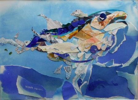
"Fish Eye on the Sky" paper collage
Just a month ago all the collages were begun on a grid tool. Some of the grids were on felt or a ceramic tile. The idea was to stimulate nonobjective abstract designs. Only partly successful, the collages started to take on the character of earlier works that suggest an object.
The next challenge is to find color combinations reflecting the landscape for acrylic paintings. The collage making might carry over to the painting.
Saturday, March 23, 2013
Framing collages for an exhibit
Friday, February 15, 2013
Tuesday, February 05, 2013
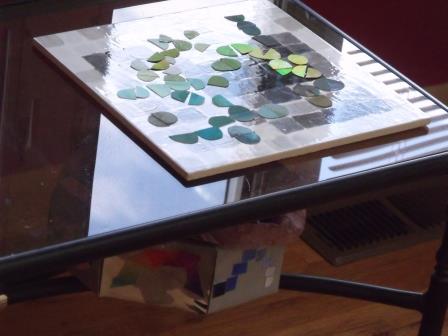
Abstract Watercolor "Color Bridges" temporary arrangement #4
The box is recycled with my painted papers. Each of the eight sides demonstrate goals for the arrangement of papers on the tile. Pictured above to the left is a construction showing volume. Right: illustrates a bridge of colors transitioning from green to purple.
Sunday, February 03, 2013
Watercolor Abstract "Color Bridges" temporary #3
Saturday, February 02, 2013
Friday, February 01, 2013
Abstract Watercolor Collage "Color Bridges" temporary #1
Kiribati, Christmas Island the climate was such that people lived partially exposed to the outdoors with open windows and door ways. There wasn't the kind of interiors where people could keep belongings especial paper. Paper deteriorated quickly. The usual personal art forms like drawing and watercolor painting was impractical. That doesn't mean personal artistic expression did not exist. The housekeeper at the resort rearranged a dry arrangement of rocks and shells on our coffee table every day. The temporary arrangement I did today reminds me of how the islanders satisfied the creative urge.
Thursday, January 31, 2013
Table Top Color Bridges Game
Monday, January 28, 2013
Layered Transparency Watercolor Collage Changed into two
Subscribe to:
Posts (Atom)