About Me

My photo
Documenting a period in my development that could become pivotal
Showing posts with label abstracts about paint as paint. Show all posts

Wednesday, February 02, 2011

The High of an Art Reception Coupled with Humbling Studio Management

In one painting of a thousand or so unfinished ones I poured rehydrated Bengal Rose gouache. It powdered and pealed. Then I put semi gloss, UV, satin varnish on it. The paint became brittle and pealed more. I like the pealing but it is so fragile, I am not sure I can save it. Today I adhered the 300 pound cotton rag paper to a museum board and flooded the pealing areas with Liquitex gloss varnish and medium.
An important reason for this show is empty our house so I could go through my work and separate what is important to me from the works that fall short. And there are many unfinished or do not rise my pulse. I framed works selected by my daughters and prepared 17 large surfaces for oil or acrylics.
For years I have not been so critical of my own work. Every day more and more goes in the recyclable pile. Tomorrow I hope to start working from the immediate here and now instead of trying to save an old work.
Sunday my retrospective reception talk and tour was attended by loving family and good friends. The theme of paintings was paintings while my husband fishes the past 46 years of the 50 years represented. My 9 slide show brought some good suggestions as to whether or not fish hooks were the most basic invention upon which all others stem. To cover their ideas, I am adding four more slides from our trip to South America.


Saturday, January 08, 2011

Fast Drying, Juicy Watercolors Painted by the Wood Stove

Salvaging is a freeing experience. First I selected several hundred watercolors that are not special to me. Some are very old and good paintings but just not that great. I am painting either on the back or on top of bright color. I salvage all the paint from a tube, meaning I feel free to use large amounts of color. The fireplace is very warm and dries the puddles of paint with amazing speed.


Dried, painted papers are hung on the bulletin board. I am considering these for further layers, collages, or maybe as finished work.

Sunday, July 18, 2010

Frederick Heidel's "Garden Around Four" - a political vision?


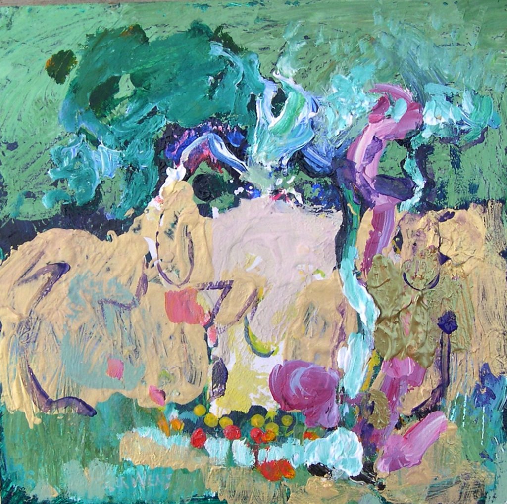
Between 1962 -1965 Frederick Heidel was my painting instructor at Portland State College and again for a summer watercolor figure painting class in 1976. The gist of his instruction was learning the language of large color areas and sensitive line. He questioned us on how much the subject should be the concern in our painting or just a beginning to explore paint - a question for each student to answer themselves.

Around 1885, "Garden Around Four", 63 x50 1/2" was one of his acrylic paintings in an exhibit presented by the Fountain Gallery of Portland now known as the Laura Russo Gallery. http://www.laurarusso.com/

This painting made me feel happy and reminded me of weaving and mosaics - two interests I share with Heidel. It makes me want to play with color. For years I thought of his painting as being primarily about paint and did not read much meaning into it other than there were two women at tea in the garden. When studying under Heidel, I had a theory of how broken glass and ceramic shapes could be arranged on a tinted cement background. In Heidel's painting he organized natural shaped brush strokes using extra long, filbert brushes. In a painting with the colors so separated by the ground, my impression is that the subject is in the process of coming apart. In a mosaic the pieces are obviously from something broken and they are being put together.

A painting of depth invites interpretation beyond the intentions of the painter.

Politics today has woken me to further musing. Now I see "Garden at Four" as a vision of the female aspects of politics. The "Garden" refers to World War II freedom gardens. The figure to the right is like Sarah Palin wearing a buccaneer's shirt and a Peter Pan's hat. On the left is a female in a blue striped dress. Her hand has just tipped the full glass of pink lemonade. Her breasts shoot blood towards two hot peppers like two wars on the table. Where her head should be there is nothing but above towards the right is an enlarged donkey's head broken by cross hatches. On the arbor above the donkey party head is zigzagging lines talking at Sarah Palin on the right who is throwing cold water on the table.

The painting of the "Garden at Four" remains relevant although it is a comment on the Regan Administration. In 1984 Regan was reelected and he declared us to be at the "Morning in America". The two hot peppers on the table were Grenada and Libya. Just why Heidel represented the Democrat and the Republican parties as women is interesting to speculate. Possibly because the arguments between them were strident voices of women -- a negative attribute of women.

I am amused by another aspect of this painting. The brush strokes suggest the fraying and the coming apart of the fabric of culture. Heidel did not give me an A for one painting credit because I painted the dissolving and destruction of an urban renewal project that bulldozed a predominately Jewish district adjacent to Portland State College. In 1965 he said picturing destruction is anti-art. Twenty years later he might have changed his mind in his painting of a very incredible vision of America that is a standing example of the beauty of the American political system always looking shaky but still here. It is hard to say if he meant four in the morning or four in the afternoon at tea party time.


Posted by Picasa

Monday, June 01, 2009

Ultramarine Squared and White Spade Abstracts.

"Ultramarine Squared," started as a yellow then red composition and after many layers of washes I topped them with Ultramarine. I was surprised at how much white rose to the surface to make a ligher ultramarine. The paint had hardened in the tube and after weeks of soaking finally dissolved. Watercolor and gouache, 30"x 22", $300
White Spade is in a field of green with two white diamonds. I had no objective. I just like the paint colors, watercolor, 30" x 22", $300

Friday, May 29, 2009

Paintings at Seal Rock


Sheltered Pools, watercolor and watercolor crayon in sketch book, 5" x 9", $90

Here are some paintings exploring the journey towards non-objective paintings done from the window in the rental house. Then when I painted outdoors in the sand and cool, the usual urge to illustrate the primal gestures of rock and water over shadowed my trial direction towards paint for paint's sake springing from inspiring nature.


Green Life Center, watercolor and gouache, 6" x 10", $120


Two Rocks in Water, Gouache, 5" x 11", $80


In the well stocked library at the house where we stayed is a small paper back volume, "The World View of Paul Cezanne, A Psychic Interpretation", by Jane Roberts, Introduction by Seth. I wait until another visit to read the entire book, but I did find a quote that validates my old journey in painting. P. 118
Nature's vitality must be suggested through the artist's strokes and squiggles of color each seemingly alive, rising up from the canvas as, for example, the stem from the ground - not all at once with its final thickness and height, but in strokes mimicking natures own rhythms as the stem grows invisible but vital inches at a time...So the brushstrokes must capture that invisible thrust.


I have talked about energy movement in earlier posts. Rhythm of strokes that grow with invisible thrust has been a focus for so long I started to paint as I have been doing adapting the manner of Cezanne.


Boughs after Cezanne, gouache, 6" x 15", $90


I have also admired Winslow Homer. It wasn't my intention. I just didn't know as usual where the painting would go and the wet atmosphere on the sandy beach prompted me to paint this way because I was enjoying the granular softness.


Rock Stands Against Sudden Wave, watercolor and gouache, 8" x 10", $90

Saturday, May 23, 2009

Diane Hoff's pastel and dualchrome mica painting workshop

This was a day of eye candy and play with important lessons on what I could be doing to improve how I paint. I do criticise my work and that keeps the intuitive under a lid. We were given many tools to give our creative selves permission. Diane has just two more work shops left before going to Scotland where she will build another teaching studio.

The first painting we did was with two colors - a warm and a cool. We looked at the stimulus object in nature but not the paper. I chose a doorway with a chair and planter jars. The purpose of using the non-dominate hand is that you really look and experience nature more fully in a tactile non-verbal awareness. To make this experience different from what I ordinarily do in abstracted painting was to use some architectural angles in the doors and chair. I used the angularity as a opposed to organic form without trying to reproduce the scene.
We picked two colors that we didn't like - Thalo green and lamp black. Also a watercolor pencil . I hated the result until I dripped some dualchrome green and gold to extend the thalo green to another sensation.


On a prepared paper with iridescent gold and mauve tinted paper I used a weathered tree stump for the linear detail and form. The color perole orange was a favorite choice unrelated to the subject. The stump was not important as an object for the painting.


These two paintings on Canson watercolor paper were done playing one off the other. Some dried Fennel pods were the springboard for a beginning to stimulate an inward intuitive journey where playing was the rule of the day. Well the word rule is poor because we were encouraged not to try to make something that fits in preconceived formula. We were trying to shut out the critics in our head and learn from new adventures. These two were done using iridescent pastel and water. I loved the paper and wished to play the paper against the pastel brushed like paint.


Iridescent and duochrome acrylic on dark gray Spectrum toothy sandy paper. The fern texture came from blotting it on another paper pictured below.


Iridescent acrylics on Spectrum pastel mixed media paper from Australia.

Monday, February 11, 2008

Continuing the same modular

Here is the first modular frame with borrowed boxes from the diptych. Surprising how different the mood is by changing the panels.


I paint abstracts very much like I do representational and fantasy. Often colors are mixed on the surface of the painting. They are adjusted by layering. sometimes I do not like the textures that build up.

Tuesday, January 01, 2008

Eighth Day Resolution of Modular Frame

The Modular Frame is pushing our skills to the limit. It is a new idea materializing. My collaborative partner, my husband, worked in the shop today trying to make a companion piece for the one I am working on. As might be expected in working out the kinks in a new creation not all is perfect on the first try. The tolerance of the fit is very slim in each of the nine compartments in the frame. These frames are difficult to make just right with my husbands equipment.
Below are some blocks evolved to final resolution. the modular frame is a 23 3/4" square. Each of these deep cradled boxes are 6 inch squares. The medium is watercolor with acrylic medium and acrylic paint. The modular can be hung on the wall or placed in a stand for putting on tables. The complete modular with stand is for sale $900.


Tuesday, January 23, 2007

Non-objective Abstract: About Red Oxide


Acrylic with collage on cradled Ampersand hardboard, 14" x 11" x 7/8", no frame required, $120. Thank you for visiting my blog, your comments are appreciated and I will try to answer each in my stories about my work. To purchase please e-mail me.

These non-objective abstracts may in part evolve from the series I am doing of our pasture. I would like my work to flow from one piece to the next, one series to the next in a linear fashion because it would be more cohesive. But my development is more complex. These abstracts also come from a collaboration with my mother four years ago during the last period of her life. We used metalic acrylics on Ampersand boards. At that point her participation was more watching than actively painting. I am sure she would be tickled that I am adding layers over what was started at her side.
One of these collaborations is "About Red Oxide." Three days ago I cut into the painting and applied more layers of paint, texturing it with a net. I used rubbing sticks fallen from our trees as well as brushes. Often I put it on the floor to help me feel like a child again. I like to let my child out to play with the paint but that isn't always easy. We all have this child in us but as adults we have learned to supress it. This painting went through difficult stages where my adult judge said there was too much going on and I want it to have a single statement. In this frame of mind I can destroy distractions but my touch of child's whimsy is threatened. Then it is good to leave the painting and work on another for awhile.

Saturday, January 20, 2007

Non-objective Abstract: About Red


Acrylic on cradled Ampersand board, 10" x 8"x 7/8", no frame required, $100. Thank you for looking at my blog, comments are welcome. To purchase please e-mail me.

Went for a drive to Newport and Lincoln City, Oregon. Did some sketches of the Yaquina Bridge and boat harbor abstracting the complexity into horizontal and vertical lines. Then a van parked in front of my view and all the fun began. Their window distorted the bridge and boats. Soon I may use these sketches in my non-objective paintings. At home after the drive my painting is unrelated to what I saw. I don't know why.

Friday, January 19, 2007

Non-objective Abstract: Party Time


Acrylic and paper clay on cradled Ampersand board, 11" x 14" x 7/8", $120. Thank you for visiting my blog and your comments are welcome. If interested in purchasing please e-mail me.

From time to time I have been posting abstract paintings but now I am starting a series.

Wednesday, December 27, 2006

Abstract Landscape: "Hidden Players"


Acrylic on cradled masonite board, 12" square 7/8" deep, no frame required, $145. To purchase please e-mail me.

In January I am looking forward to painting more outdoors. I will continue to work intuitively not knowing what the result will be when I begin each work. But I expect to be painting the same clouds, trees, and bird houses in more abstracted forms to pursue expressing my feelings. "Hidden Players" is a preview of what I expect to come.

Saturday, December 23, 2006

Abstract Painting, "In Tune"


Mixed media with acrylic, oil bar, and oil paints, on an Ampersand board box, 14" x 11" x 7/8", no frame required, $150. To purchase please e-mail me.
Some bright color feels good when there are so few hours of light. Must run now because the clouds are getting interesting for tomorrow's painting.

Wednesday, December 20, 2006

Abstract Painting, "December Boggie Woggie"


Mixed media, the acrylics include metalics and interference colors plus oil paints, on a masonite wood box, frame not frequired, 7" x 5" x 7/8", $125. To purchase e-mail me. This painting was started in 2002 and just now going through some of my old small paintings I had the inspiration that the colors and lines could suggest my path in preparing for the holidays. I just lean one way until I almost fall then I change directions in the nick of time to get all the food and gifts ready.

Saturday, December 09, 2006

Abstract Painting # 3, "Moon Setting Before Dawn"


"Moon Setting Before Dawn" is a mixed media painting on a hardboard Ampersand box ready to hang, no frame needed, 8"x 10", $185, can be purchased by e-mailing me. (I am in the process of setting up a Pay Pal account.) This abstract has long been in my almost complete pile. Today I brought it out because the colors were like what I saw the morning of December 5th. I was inspired to complete it. It is acrylic with a few brush strokes of oil paint and lines of oil bar.

Wednesday, March 01, 2006

My Dragons Express Opposites

This painting is not for sale.
There is the desire to keep a gag on my camel headed dragon and hide my paintings and art treasures. Being public can hurt. There is however a much greater desire to spit out the gag and be a genie sharing the pearl of my creativity.
The whimsy of these dragons were inspired by the smiling camels at Doris Duke's Shangri La. More about my paintings inspired by the museum are in earlier postings.